Herman Francisco

—Problem

Jewelry startup needs e-commerce presence to introduce they brand to the world and gain market share.

With product on it’s way from the manufacturer, Herman needed a way to sell beyond DM’s and emails. Also a way to boost visibility beyond social channels and word of mouth.

With this solution, Herman can stop taking time out of his day to direct sell to clients, and use marketing to gain a broader client base.

See the Site

 
HF_Mock_Up.png


Role

Entrepreneurial Project
UX | UI Design
Product Development
CMS Implementation

Date

Sept 2018 - Present

Team Roles

Herman DeLaSantos
Frank Cademarti


Methods

Usability Patterns

Practices

Prototypes
Wireframes
Information Architecture
Agile Feedback Loop
Midnight burns


Tools

Pen & Paper
Adobe XD
Adobe Photoshop
Adobe Illustrator


Scope & Planning

Build the project as close to the intended design, within set framework, making concessions only where absolutely necessary. All while ensuring ease of purchase through usability patterns and minimal clicks.

post+2.jpg
 

Information Architecture

Knowing exactly what we needed on the the site was critical. Ensuring that we had a good mix of branding and product shots to get his message across was the number one priority when starting the initial build.

HF_Pages1.jpg
 

Created a working list of pages we would need allowed us to start developing patterns and round ideas

HF_Prelimanry_Site_Map.png

Preliminary Site Map created a roadmap for design and build out.

Ideation


Hand sketches allowed us to filter out the bad ideas and let good ones trickel though.

 
HF_ Rough2.jpg
HF_Ideation.jpg

Marketing Pivot

After a delay in production we decided to move to a one page, email capture to be informed of the launch. This gave us data collection, and the ability to follow up with potential customers when the time came.

HF_One_Pagers2.jpg
HF_One_Pagers.jpg


Pre build PSD Mockups were created to ensure placement and responsiveness was agreed upon

HF_One_Page_Responsive.jpg

*note different alignment of CTA. This allowed for choice by stake holders.

Build out

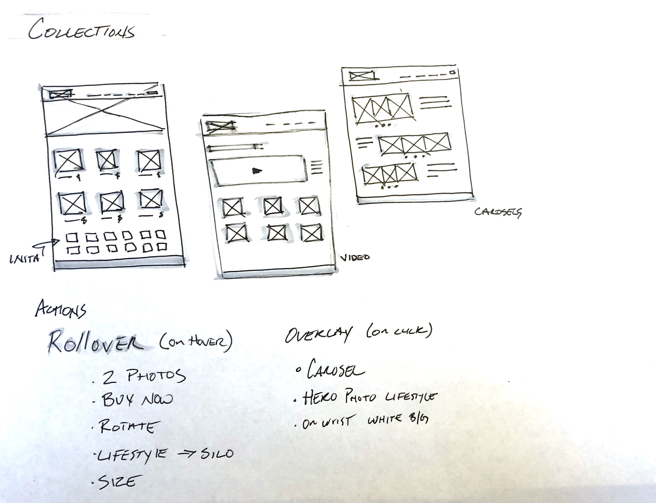
Back on track, we decided due to the small nature of the shop, we would eliminate a traditional landing page for an overview or Collection page of the brand. Below are different concepts based loosely on Miansai, Kendra Scott, and large retailers.

HF_Landing_Page.jpg
Collections_Pages.jpg
 
HF_Collections2.jpg
HF_Static_Dynamic.jpg
 

Static vs Dynamic

The KISS philosophy lead us to agree upon a simple layout with a repeatable, easy to read UX implementing, clear CTA and distinctly different collections while keeping a dark thematic branding to the whole site.

Final Design

Getting a good sense of the layout and feel of the website, we moved to digital wireframes push the design a bit closer to accurate representation of the buildout.

HF_Wireframes.jpg

Insurance

To ensure we stayed on track during photography I designed a template using a 10 grid system. Herman would manage the photography and send over assets to be uploaded.

HF_Mock_UP_10th.png

*Photography template sent to ensure product, H1 , CTA, and Product alignment


Midnight Burn

Even before the assets were sent to me, I started building the site, constructing blocks in the CMS and ensuring copy and photos had places once they were completed. Most site styles were selected and implemented on Herman’s end as we both had editing capabilities. Once we had all assets placed, we had a midnight burn session, testing, retesting, and tweaking the site. Agreeing on a parallax template, some trickery was done manipulating the template to act they way we wanted. giving us a seamless look between each of the “pages” so they behaved like blocks. Buttons, fonts and other minor design decisions throughout the night.

Other tweeks would be made at later dates, and as we let the design marinate overtime, collecting feedback from users.

Results

See the final website at www.HermanFrancisco.com

Matching the problem statement, world visibly was the goal of the website. During the 2018 year we saw 3,460 view with the average person viewing 2.7 pages per visit. Partnering with Herman for marketing we saw great reach around the globe, gaining visibility on 6 continents and over 40 unique countries. We are looking to iterate on the site, creating new imagery and refactoring to see if there is an uptick in visibility and sales.

Screen Shot 2020-03-14 at 9.17.49 PM.png


Screen Shot 2020-03-14 at 9.18.48 PM.png

*2018 Data provided by Squarespace

More Projects