WF Case Study
— Problem
Harboring anxiety about my finances, I turn to find all my auto payments and subscriptions to get my finances under control.
Frustrated locating a central hub for all autopays, subscriptions and recurring payments each month, I take dive deeper into creating an additive feature to the Wells Fargo App.
Hoping this new feature will make it easier for users to find all of these in place for easy review and management.
Read Full Study

Team Roles
Frank Cademarti
Date
October 2018
Methods
Time Management
Design Thinking
Iconography
Practices
User Survey
User Interviews
Usability Patterns
Iconography
A/B Testing
Tools
Pen & Paper
Adobe XD
Adobe Illustrator
Scope & Planning
Through a user interviews, wireframes, and a variety of design methods we would create and test multiple versions of the new feature to ensure easy use.
Setting up a 10 question user survey mixing in 2 qualifying questions allowed me to filter out users that would not be pertain to the process. Users would have to have to use any mobile banking app, and have at minimum 2 monthly autopays set up through their bank. Qualitative usability testing and research would follow.
User Interviews / Usability Testing
Now that the feature in question was found I choose to use a mix of candidates to test my app with. Out of 15 people 5 meet the criteria, but in the sake of time choose to interview three, only one of which utilized the product in question.
Logged into my account, I simply asked them to turn off my ATT auto pay.
Interview Results


Mike was my first tester, and my cash cow. Six minutes of searching he found the dashboard for the Autopay management. He completely changed the project.
Laura was my last tester, she struggled like the two before her. She navigated systemically at one point, then abandoned the method as her attention span dwindled. Her persistence paid off when she found how shut off a card, which was good enough for me.
Dave having and IT background was very specific on what the task was. He also dose not use WF so this made for a blind test. Like the others he took 5/6 mins, perusing the app, mainly focus on the hamburger menu and the account summary. He also eventually found the autopay dashborad.
Pain Points
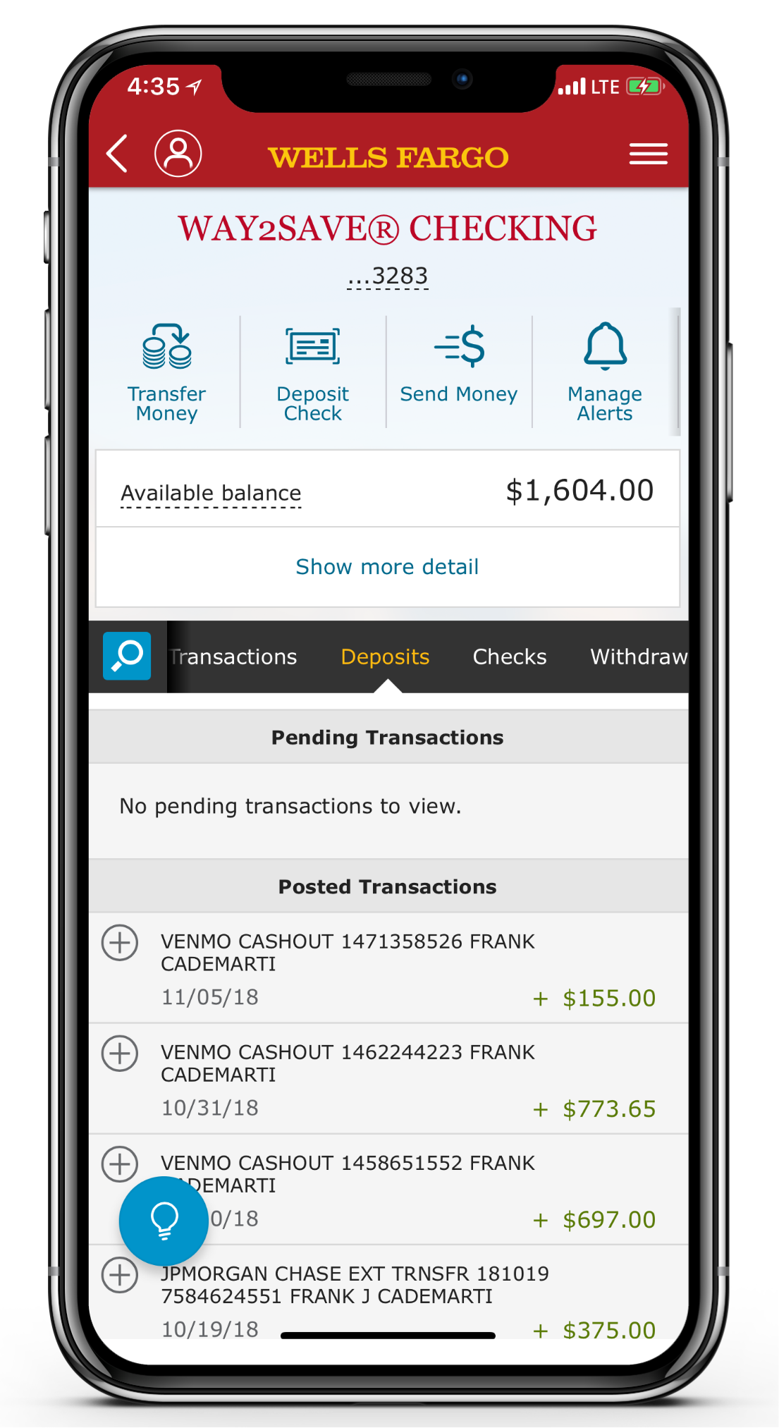
1. The autopay dashboard is buried under the profile icon. Not the first place any of the users ended up looking.
2. Users thought that the autopays would be located in “Account Services” tab under the hamburger menu.
3. What is CONTROL TOWER?!?
Control Tower
What Went Wrong?
Control Tower, this was to be a new feature that they would revolutionize and simplify the management of your personal finances. Features like this, along with Zelle Payments were to keep WF current with the current and emerging products within this space in and outside of the traditional financial sector.

Launched in October, a month before this study, I received no update, no email about the new feature, or in app notification. We have seen this many times before, a quick in app onboarding with interactions taking you to and or thought he new process. There was none.
**Resources
https://newsroom.wf.com/press-release/innovation-and-technology/wells-fargo-reimagines-mobile-experience-pay-wells-fargo
https://www.businesswire.com/news/home/20181001005683/en/Wells-Fargo-Launches-Control-Tower-SM-New
Let’s Fix it…..But how?
Icon vs Verbiage
Forgoing wire frames to solve this problem, I focused my attention on the hierarchy of the apps information architecture. It appeared their new features were within the largest navigation on any given screen. I also noticed during testing, the second most used area was the same navigation.
Setting up for more testing I designed new icons for Control Tower some found on the app and some newly designed. Following design patterns found within the app, I knew I would have to pair with verbiage. In addition due to pain points uncovered in the user interviews testing accopainy verbiage that coincided with the feature was crucial.
Ideation
The easiest features to find are located within the secondary navigation on the app. this changes from screen to screen, but has one thing in common, Icons mixed with simple words. I believe this is how we solve this problem.
Iconography
Verbage
Linked Payments
Subscriptions
Cyber Payments
Monthly Payments
Autopay
Automatic Payments
Recurring Payments
Digital Payments
Gamified Testing
Testing would be a pairing game with the icons and verbiage. Users were given the below groups of icons and words. Users were to “Pair the icon with the word you feel best describes it”.


Results
Utilizing classmates, friends, and family. These are the results of the icon/verbiage pairings. Recurring and along with the “Dollar Cycle” Icon came out on top with 6 people matching them together. Many people matched one icon with one term, two people going rouge and attaching multiple names to single icons.

High Fidelity Mockups
Utilizing the r
